Avatar Editor
UX/UI Design Evolution
June 2022 - Current
Project Summary:
My task was to use the existing UX/UI map and designs to redesign and implement a UI for the game using the ModStorm game engine. Afterward, I continued updating and redesigning this design as the needs of the game changed.
Avatar Editor: where players go to change their in-game outfit.
Tools Used:
My Responsibilities:



• Design UX Flows • Design UI Mock-ups • Create UI Assets • Documentation • Implement UI Logic • Communicate with & Deliver Feedback to Programmers
👇 See how I did it!
UX Map Design
Past - June 2022
(Not created by me)
I used this design for reference when I began. This design was created by an artist in Photoshop, and was intended to be used in Unity.
Some form of this design was being used when I joined Heroic Game Day.
ModStorm Design
June 2022 - October 2022
ModStorm: A web-first social gaming platform
While I worked closely with the creator of ModStorm to push support for UI needs, it was still in early development and lacked a number of UI features at the time. I had to be creative with my designs and work with ModStorm's strengths in mind.
The "Categories" and "Styles" panels did not appear to be mechanically connected in the original design. Working within the constraints of ModStorm, I swapped the avatar display and the "Styles" panel to help fix this disconnect using the law of proximity.
I wanted players to be able to make their avatar match their vision. I added in the player's name, and allowed them to switch back and forth between this screen and the name screen.
To maximize the screen real estate, I requested smaller versions of the "Undo", "Redo", and "Random" buttons. I placed these next to the avatar display so that their purpose was clear.
Lastly, I added the "Colors" panel so players would have a way to choose the color for their items. I had grand intentions to animate this panel, as it did not appear with every category, but this design was never able to see that day.
React Design
October 2022 - October 2024
React: a JavaScript library for building user interfaces
I worked with React programmers to develop a new pipeline for implementing my designs across the game. React allowed my designs to be more free, but I had to communicate my intention much more clearly through redlining, documentation, and direct communication with the React programmers.
I was glad to revisit this UI. The ModStorm design felt stale, and the game was quickly outgrowing it.
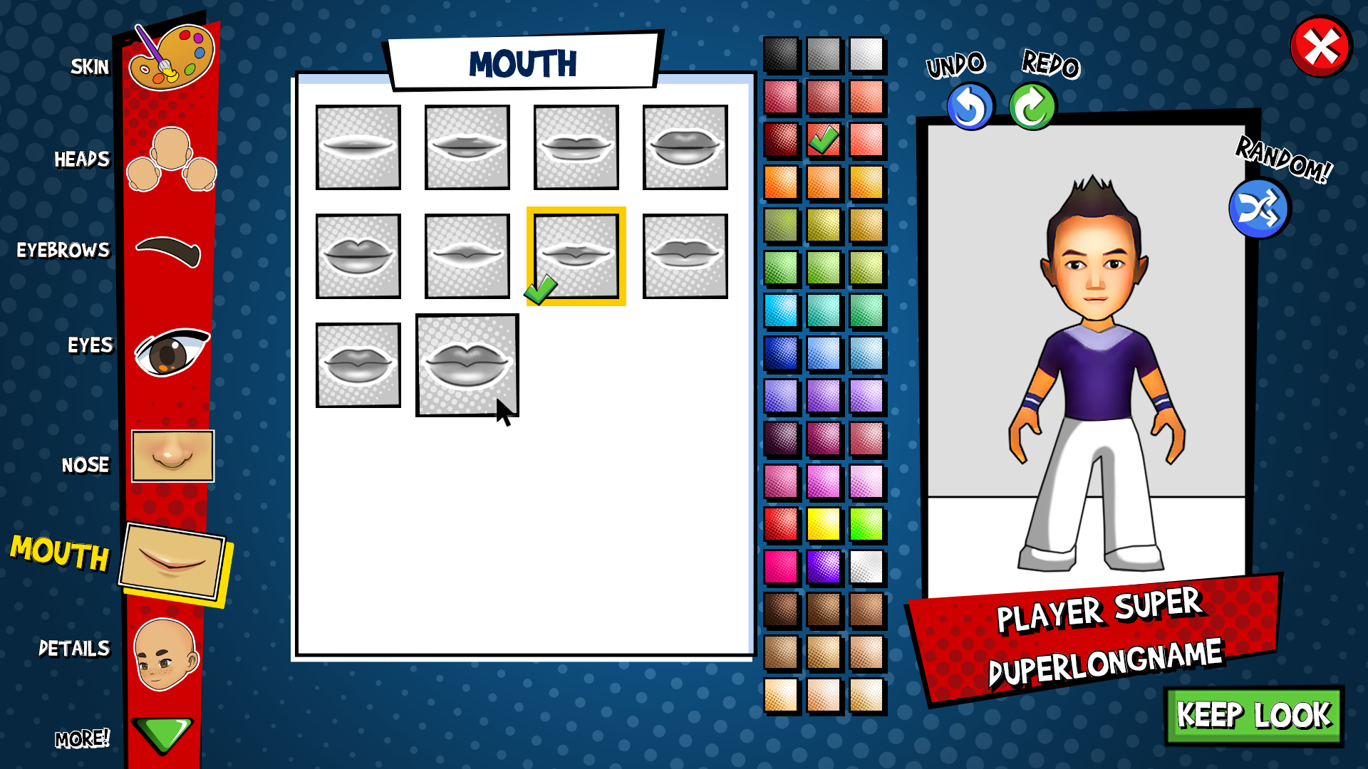
It was found from play tests that players were not very interested in dressing to match their display name, and so that button was removed from the design.
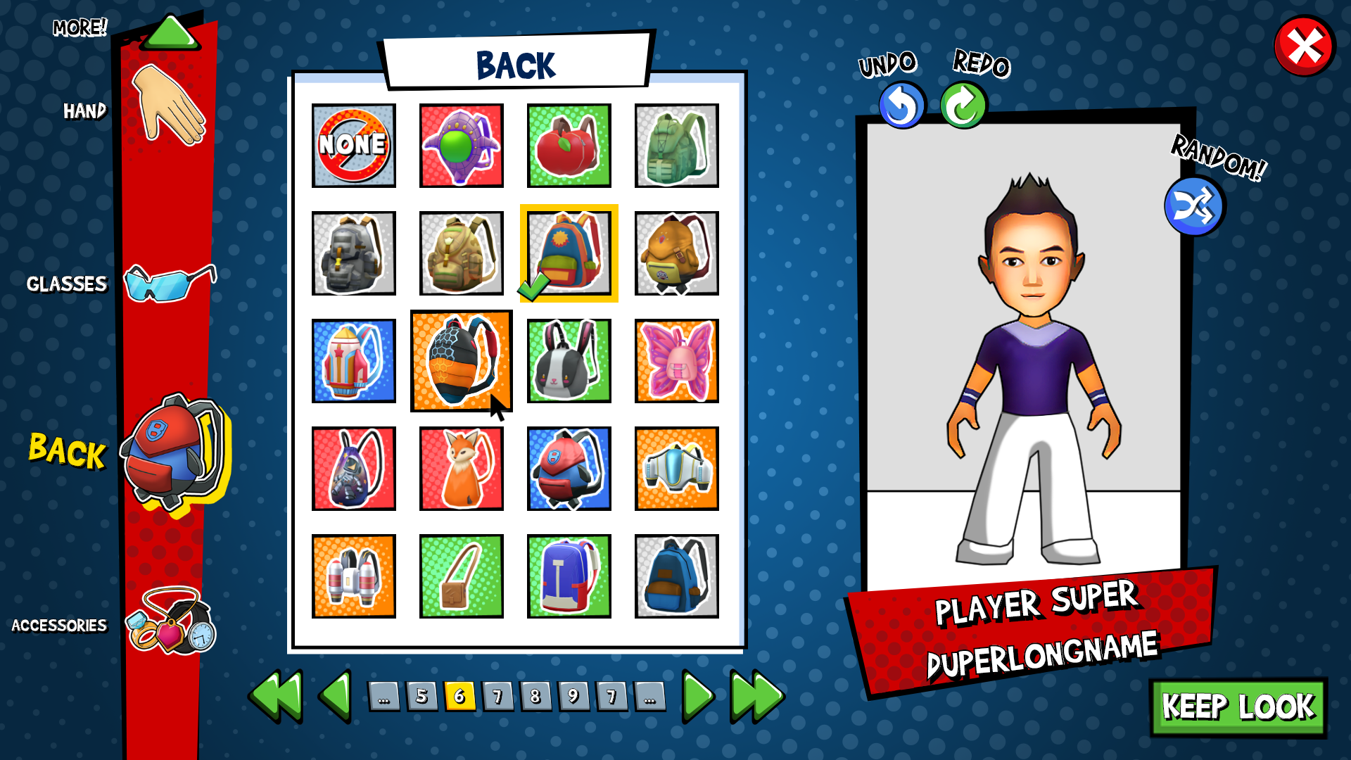
I had begun removing scrollbars-- designing for button clicks and key presses ONLY! This meant a lot of standardized changes like pagination, which I added to this design.
I had also been standardizing the "selected" and "highlighted" color across the game (previously, only certain buttons were standardized). Since I would be passing this design off to another team instead of implementing it myself, as I had done previously, I made sure to include those states in the design mockup and documentation.
I have always wanted the avatar editor to echo the clothing shop UI so that they are familiar and easy to navigate. Since I had recently added the red category bar (left) to the shops, I did the same for this design. Plus, I LOVED the dynamic feel of it, and it helped declutter the screen!
I moved the "Colors" panel to the right of the "Hair" panel. I noticed during play tests, players had difficulty or frustration when colors were on another page. So, I wanted to show all the colors at once, while allowing room for the selection to grow relatively large. However, it also had to look relatively normal if there were no colors at all.
2024 Redesign
October 2024 - Current
After watching the 2022 design for two years, we realized that players were not aware that they could scroll using the green arrow buttons. There were also a number of polish items that were never finished from the previous design that we hoped to address, as well as creating a design that would flow better with our FTUE and the hybrid React-Unity structure.
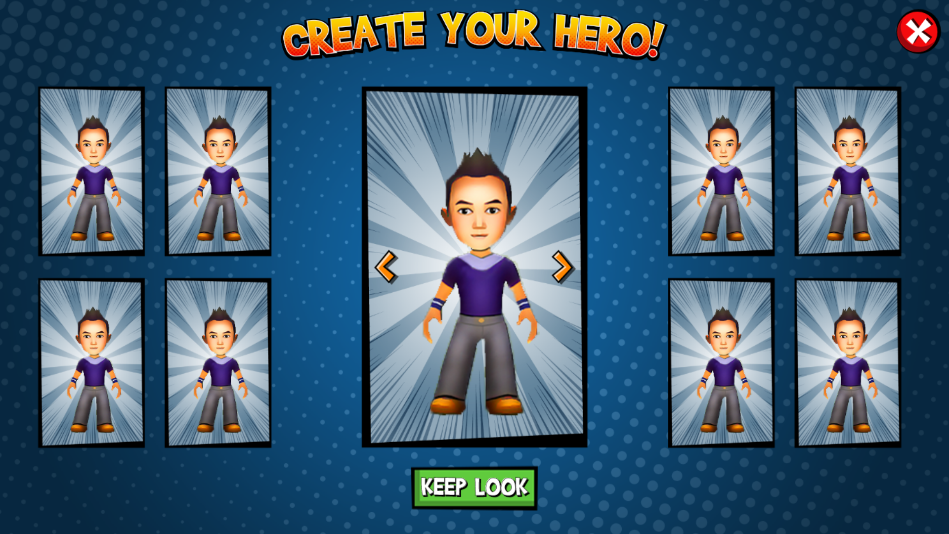
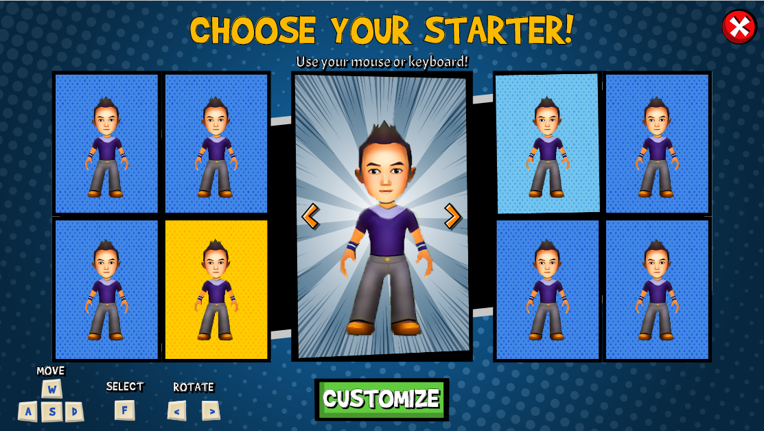
In order to simplify FTUE (and testing), we needed to add a "preset" selection screen for first-time avatar creation. I was given a mockup (left) with eight presets on-screen, so I aimed to keep it at that number. Allowing each preset to rotate looked too busy, so I elected to instead allow the player to apply the preset to the avatar in the middle, which could then be rotated using mouse or keyboard controls. Once the player liked the preset, they can click the green button to go on to the next screen to further customize their look.
Initial layout using existing assets
Adjusted layout using placeholder assets
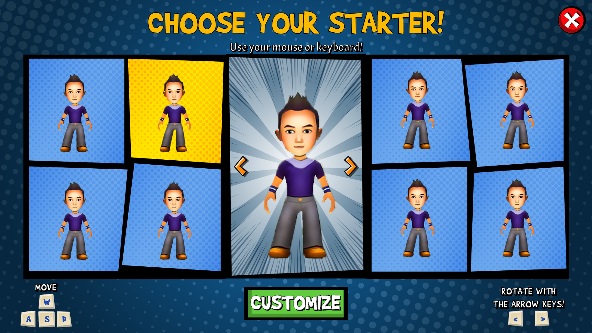
Comic book panel layout
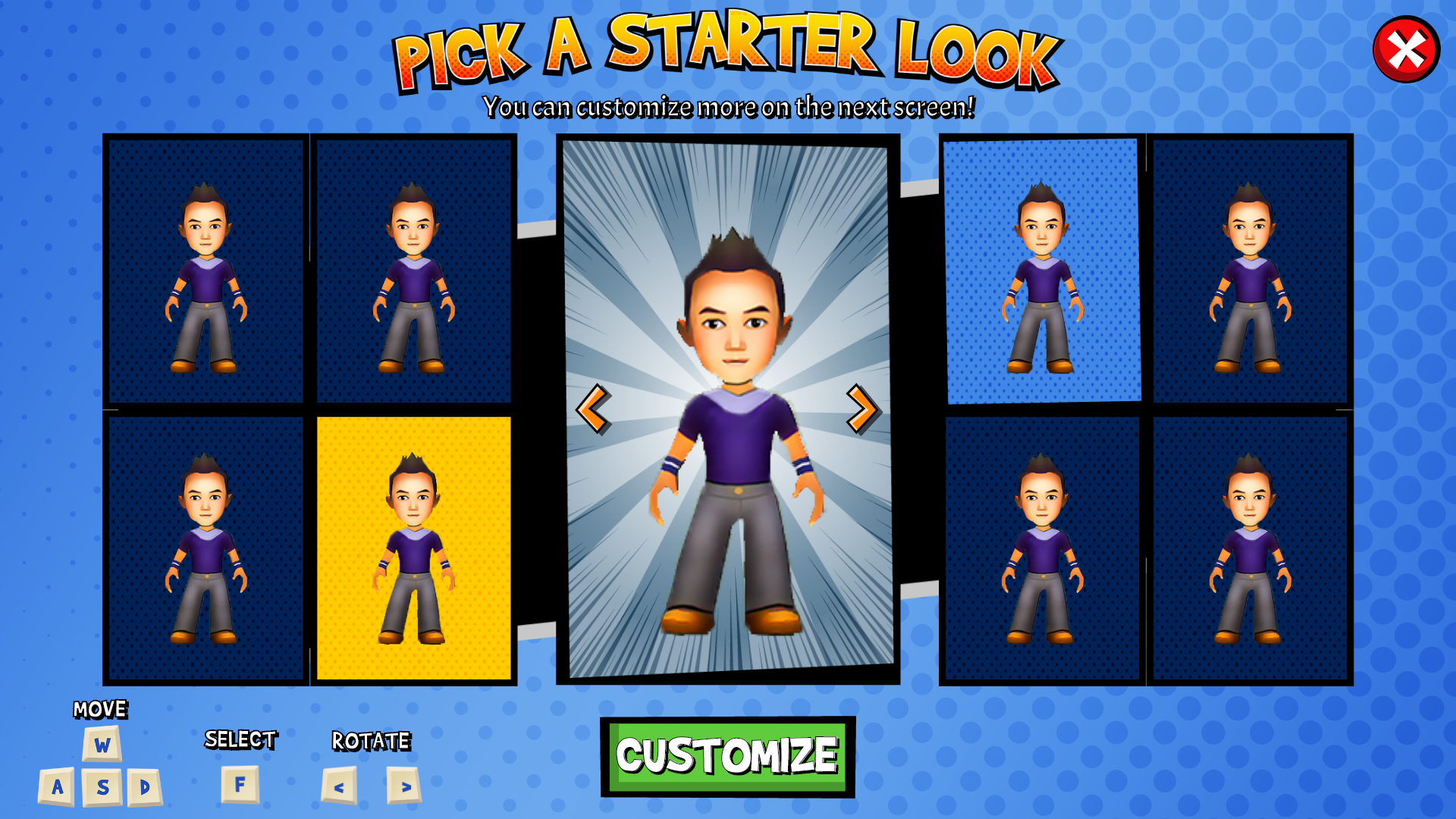
Final assets
Initially, I used existing assets to create a layout. Moving to other iterations, I used placeholder assets before creating the assets for the "preset" background buttons, the "Pick a Starter Look" header, and the black background element to give some depth to the screen.
I played around with the placement of the controls display, since on the Chromebook display, I have to be careful not to make elements too small, or else they become impossible to decipher. I eventually settled on slightly reducing the size of the preset buttons to make more room.
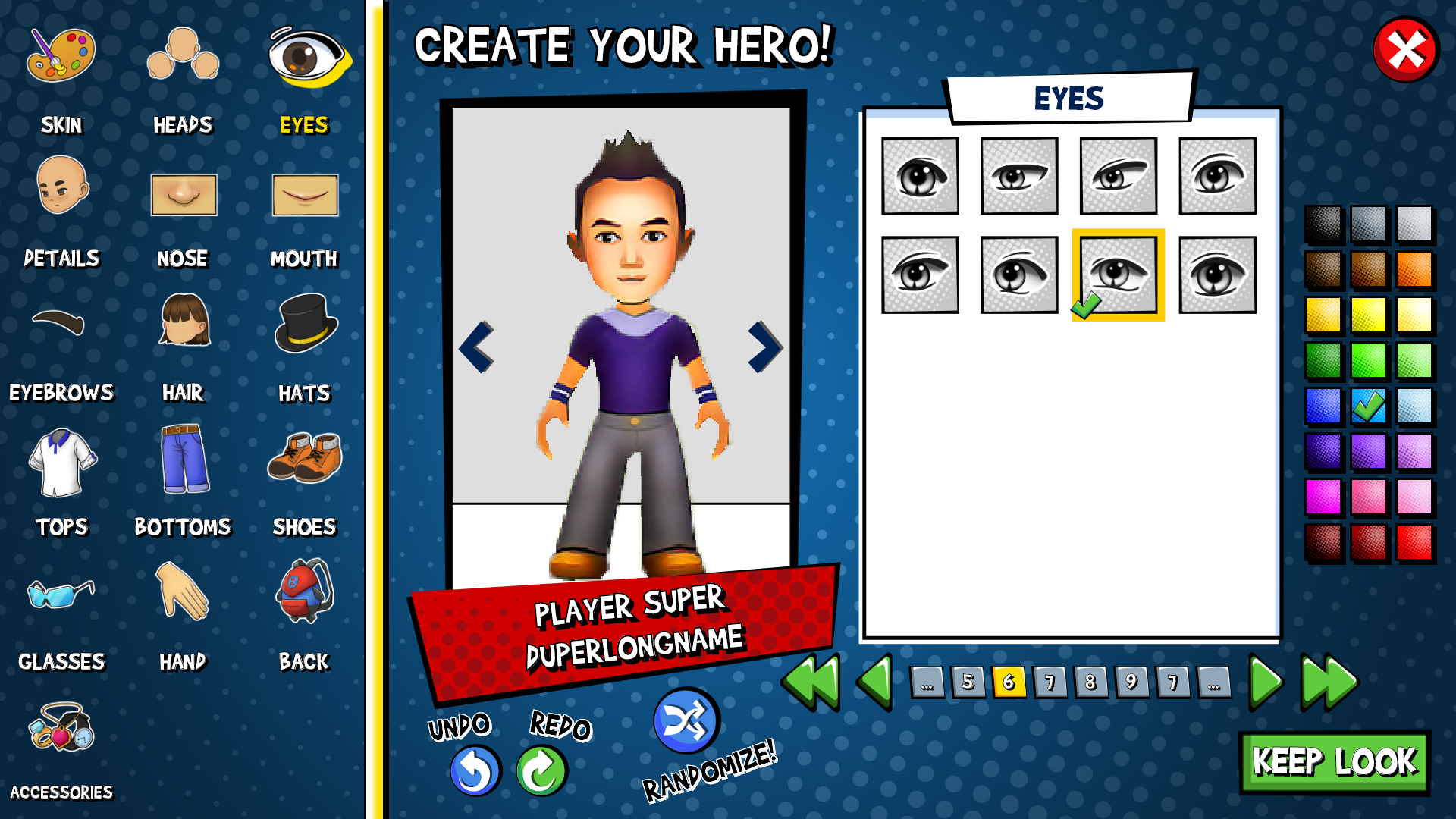
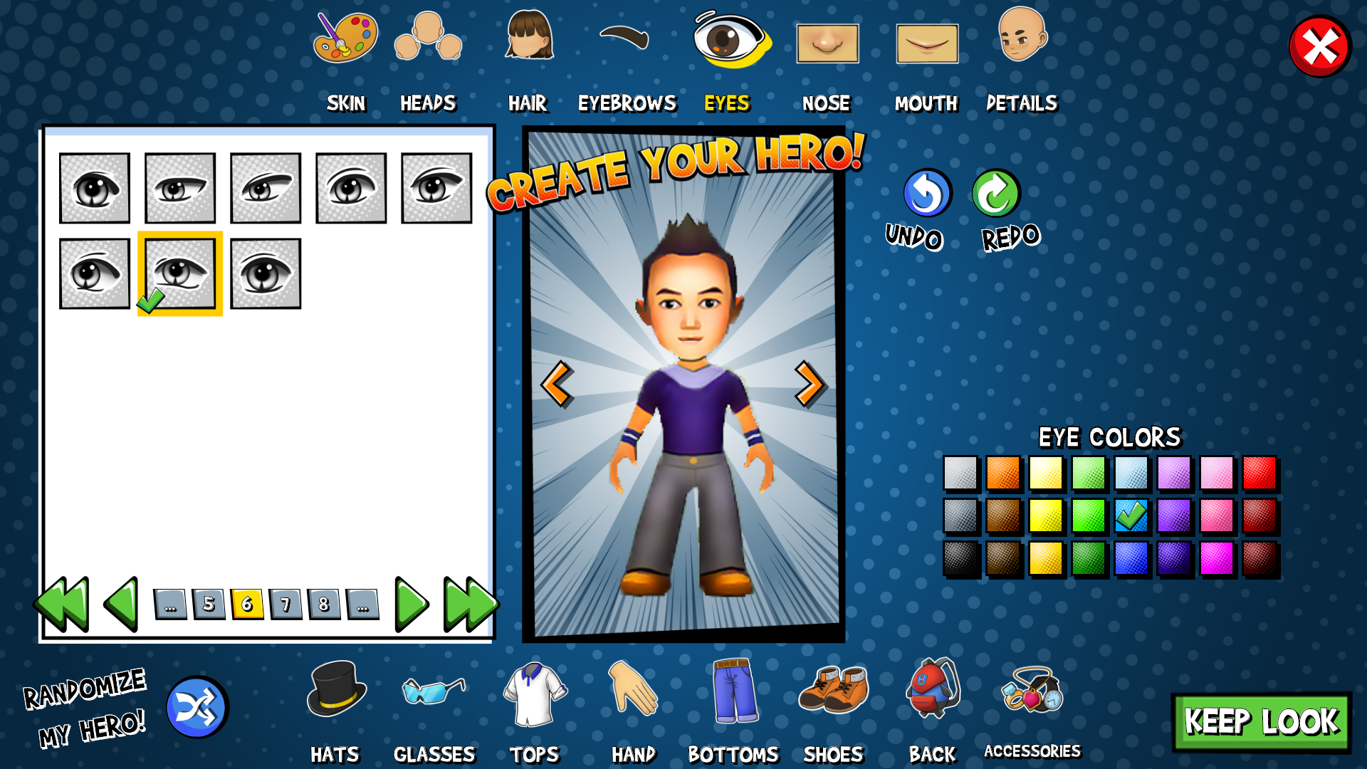
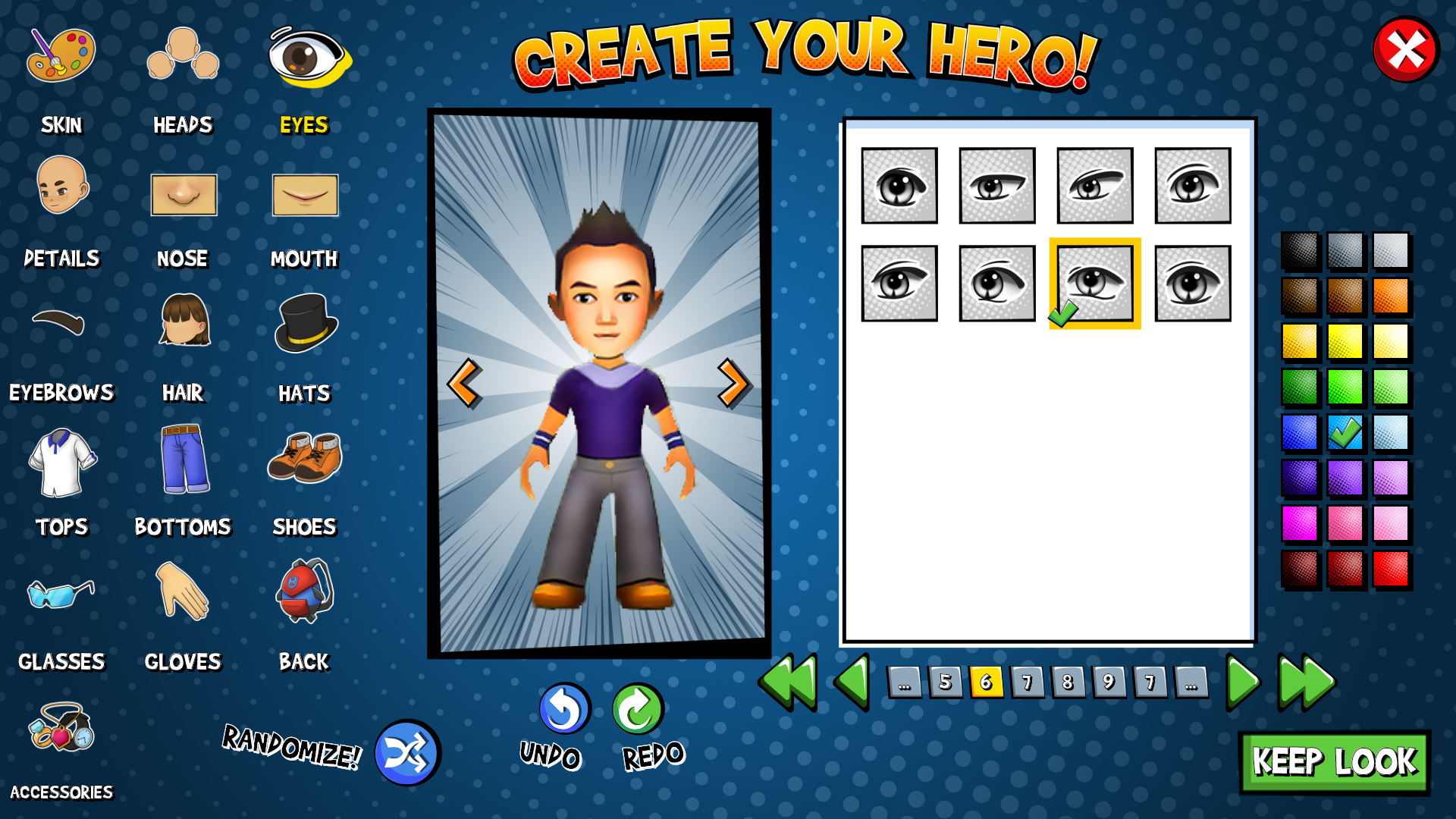
The directive for the main avatar editor was to have all the categories on screen-- this way the players should not miss them. I created three layouts as proofs-of-concept, each one showing all the elements that may need to be available at once.
I ended up taking elements from all three designs, here are some:
• Separator column background inspired by layout #1
• Undo/Redo/Randomize placement from layout #3
• Rotated the color palette horizontal (layout #2) and nested within the white panel
Final Thoughts
This project has been challenging for a few reasons:
1. The players and the technology interacting with this UI have made it obvious that previous designs did not take many of this UI's unique situations into account. This is to be expected, in my opinion-- UX/UI is more about improving than getting it 100% perfect the first time-- however, this is uniquely compounded through all the points below:
2. Each engine has had different abilities and requirements, which has meant that my design process had to change drastically over each generation of design. I may have been able to use previous designs as a jumping-off point, but they have been largely unusable or unsuitable between engines.
3. The nature of any UI that is close to the beginning of a game is that it will be scrutinized, updated, and hopefully perfected more than any other UI. This is the circumstance the Avatar Editor finds itself in.
4. The changing needs of Heroic Game Day as the company grows, shifts, and reorganizes has required relatively massive changes for this UI. Again, this is to be expected for a company such as HGD. However, for the Avatar Editor, it has meant that it suddenly no longer fulfills the needs of the company, bumping it to the top of the UI team's priorities.
These reasons, as well as a few smaller ones, have certainly made this UI in particular a bit of a tough nut to crack. I would love to have more foresight on the shifting landscape for the needs of this particular UI, since then I could try to future-proof it a little. Though, I don't think anyone at HGD could do that, either!
Over all the iterations I have made for the Avatar Editor, I have grown more fond of it. I have come to appreciate the challenge it has presented for me, and I am prouder of my work every time I finish it again, as I continue to solve more and more of the needs that this UI must provide.