Full Game UI -- Nyaa-Kuza!!
UX/UI Design Evolution
August 2020 - June 2021
Project Summary:
This game was my senior project at the University of Utah. In a group of 18 game developers (by the end, 12) we were to concept, pitch, and then create a game from scratch as if we were a game studio.
During the project, I was elected Producer by the team.
Tools Used:
My Responsibilities:



• Manage Team Meetings • Interpersonal Conflict Resolution • Promote a Culture of Collaboration • Direct Engineering Team • Create Mood Board • Design & Iterate on UI • Program & Implement UI
👇 See how I did it!
A Brief History
Nyaa-Kuza!! went through multiple discrete iterations before release. This meant that the UI had to be entirely rebuilt at least three times. Luckily, UI is something that is always changing, so I took this as an opportunity to iterate and improve on previous designs.
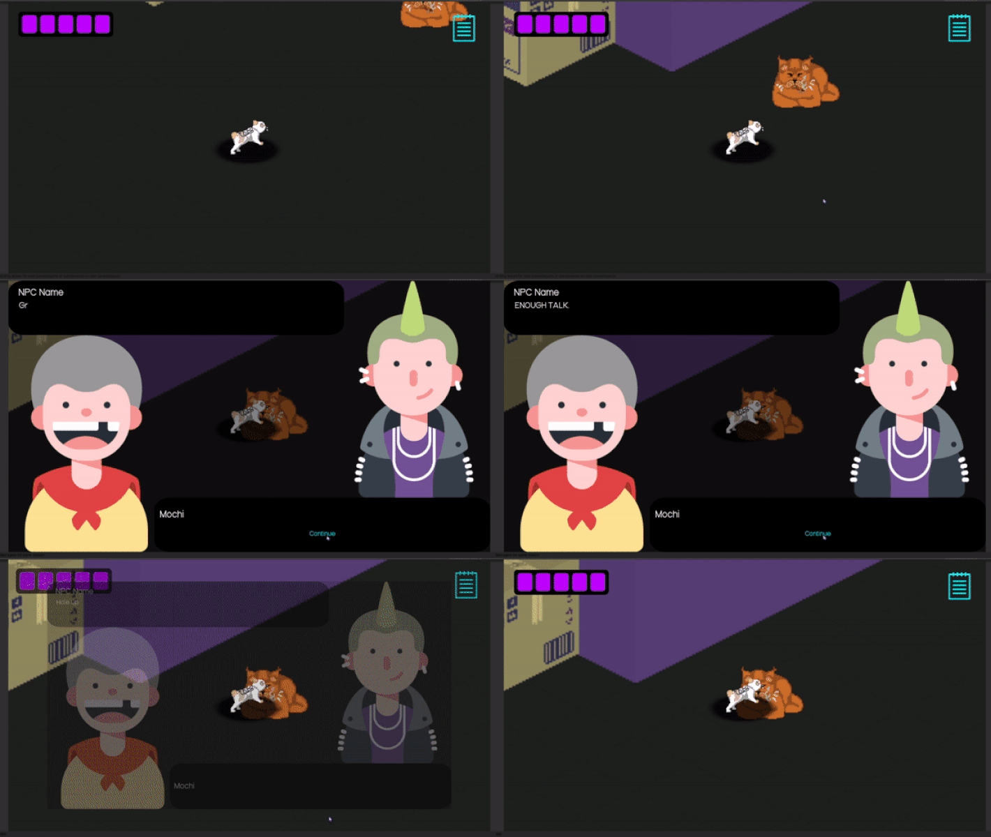
Pre-alpha
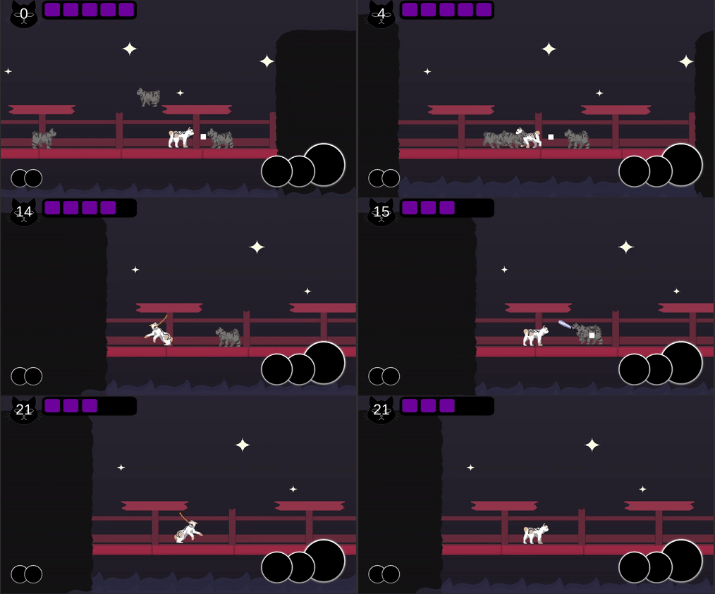
Alpha
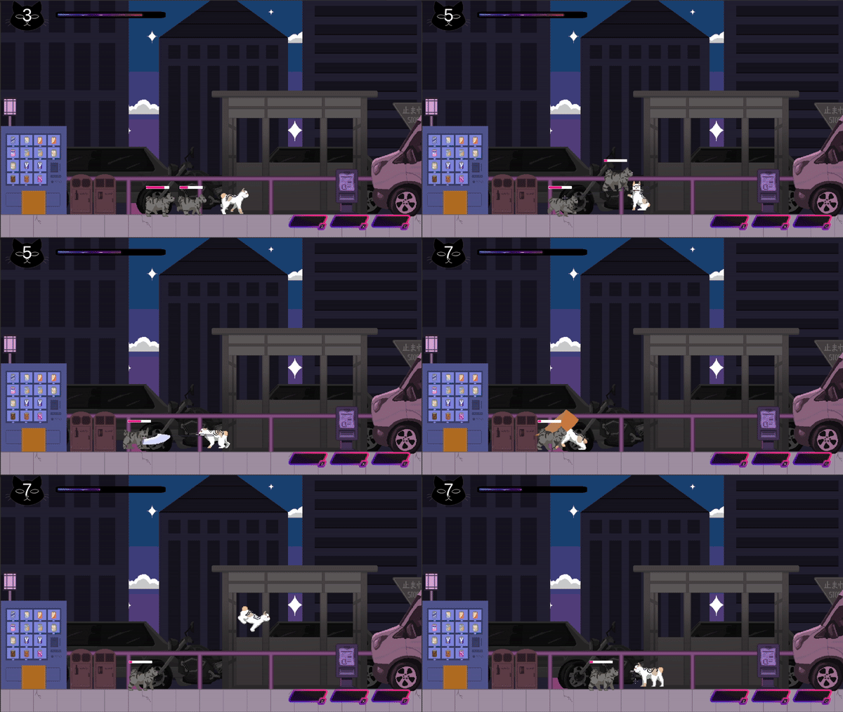
Beta
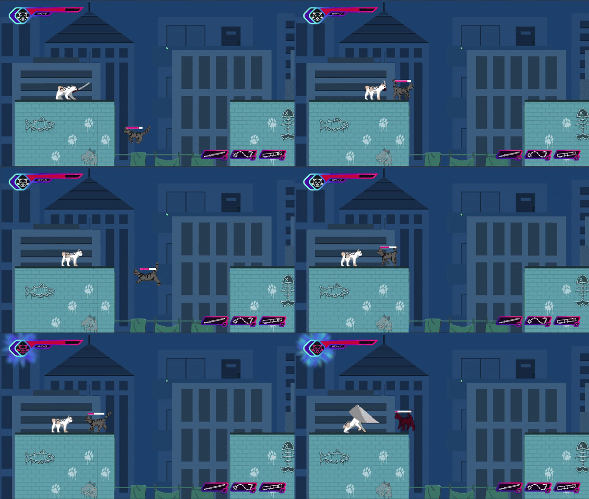
Early Access
Release
Note: Not all sections will feature examples from the earliest versions of the game.
My Role in Leadership
The game was originally pitched as a narrative-driven exploration game with a much larger scope. Instead of experimenting with and iterating on mechanics, we had to change the engine, scope, genre, and art style of our game during the first semester-- we lost a lot of development time.
In the second semester, the team elected me to replace the original producer. In the interest of time, I chose to cut many of the proposed features for a much leaner fighting game. Once my team was focused, I was amazed at how fast they put out quality work.
Main Menu
The initial main menus were simple, though I did try a few different layouts. The real breakthrough was when one of the artists told the team about an idea he had for it:
He envisioned a scrolling image that settled at the bottom. The logo would appear, and then the menu buttons would come up from the bottom of the screen.
I immediately updated the menu with a placeholder image and new layout.
I also requested neon-sign styled button assets from the UI artist, which I added a flicker effect to, played around with the colors, and tweaked the animation of. Once the final background asset was complete, I coded up the animation for the image, and the end result was gorgeous!
HUD
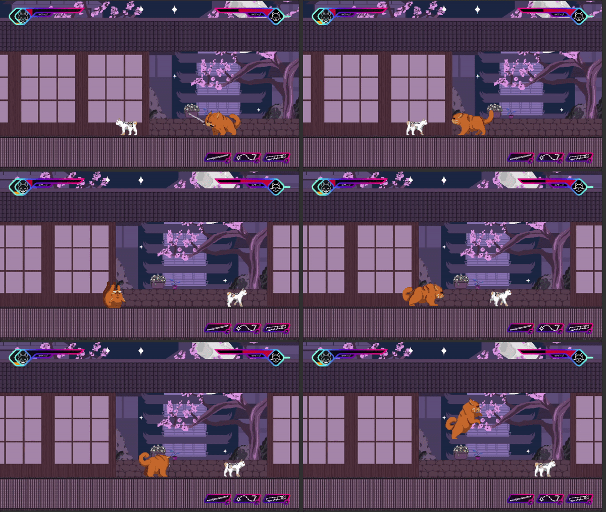
The early HUD was strictly functional. I had a few ideas for how we might approach the HUD, but with how fast our game design changed, it was hard to get a handle on until the team elected me to lead them, and we were able to make firm decisions.

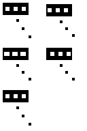
Despite many changes to the game, the first HUD retains most elements of the final HUD. The top left player status for health and the "rage meter" and the bottom right for the equipped items would remain in the final UI.
I would remove the bottom left, which was for pickups like healing items, as we could not afford to implement the feature under the deadline.
For the beta release, I was able to update some of the HUD with proper assets. I also realized that we had overlooked that the enemies need health bars! Luckily, a simple asset was all we needed.
We finally had all the UI assets in by early access, it looked good, but there was room for improvement, specifically, the rage bar.
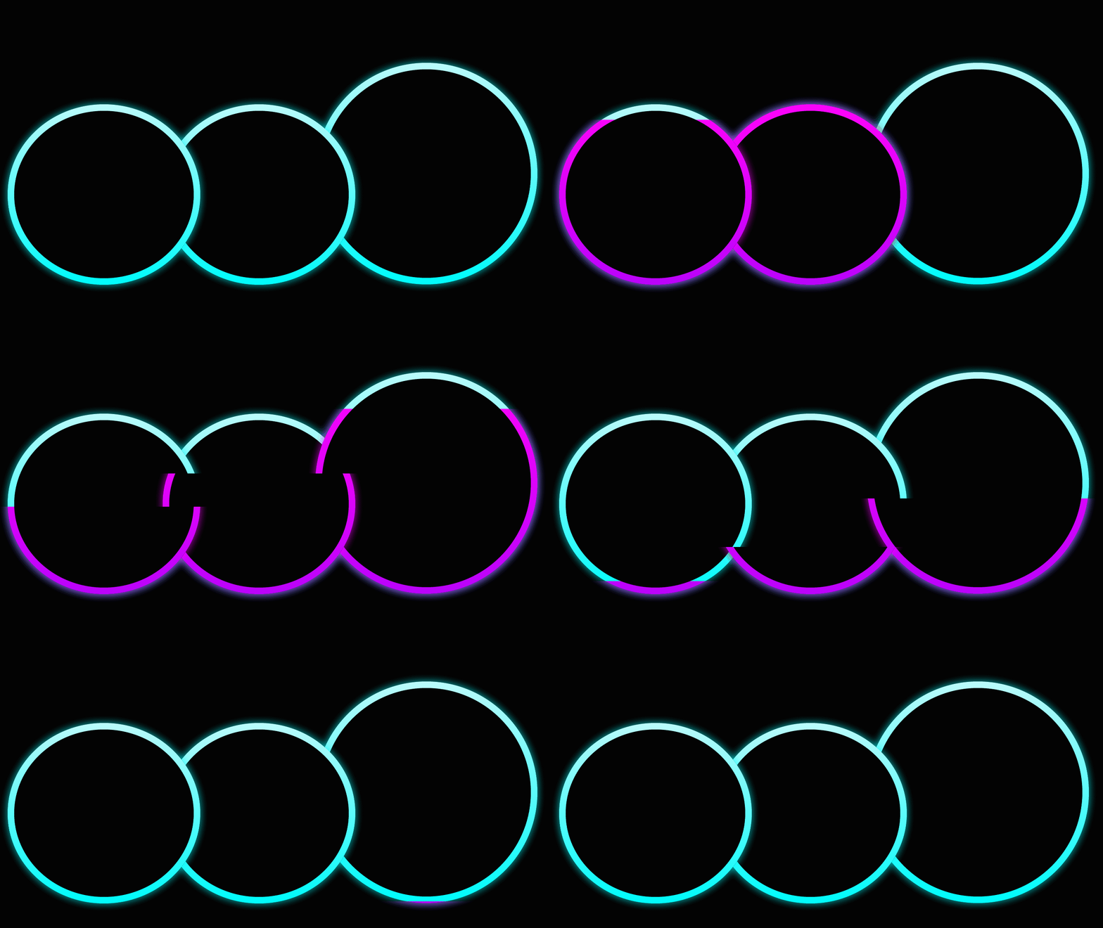
The colors we were using for the particle effect when the bar was full blended in to the backgrounds and did not catch the player's eye. This issue was further compounded by the element being at the edge of the screen; therefore in the player's peripheral vision.
I created a grid of rage bars with different colors taken from the art and presented it to the artists to get their feedback. We decided on the yellow-orange hue, as it would stand out against our backgrounds and would draw the player's attention from the periphery.
Dialogue
We always wanted our game to have a story, so I paid a lot of attention to the dialogue screen, and everyone gave their input during its development.
We had a surplus of artists, so I designed the screen to show the characters with large 2D portraits which could be hooked up to an animator to emote. I would continue to update the placement of the speech elements until the final design.
The alpha assets were updated to another style, and in this process, I changed the layout somewhat dramatically. I had been inspired by Persona 5's UI and I wanted to bring that energy
however, we quickly realized the hover state was not readable, and I worked with the artist team to come up with some ideas for our next set of UI assets.
One necessary addition was the "Skip" button. As developers, we could not live without it, but it was nice to offer it to our players who would want it, for whatever reason.
I had a complete set of new assets to work with for the UI during early access. The hover states were no longer unreadable, and we had implemented a simple animation to show which character was speaking.
This is also when the writing team made me aware of another issue. Until this point, I had been working off of placeholder text while the writing team worked on the script. They informed me the dialogue set up so that our main character would respond to the other characters, and the UI was set up the other way around! This made reading the dialogue difficult and clunky at best.
I moved the main dialogue box above the responses to make the UI totally compatible with the dialogue. Reading the dialogue was now completely natural and smooth.
I also turned the entire main dialogue box object into a button so it could be used to advance the dialogue without a specific response. To visually indicate this, I added an arrow icon in the top right corner.
Map
Later in production, we decided that, given the limited scope of our game, we should allow the player to replay levels with the different weapons we had created. Thus, we added a map as a central hub. This also worked to contextualize the scenes within the narrative.
Players were able to select their weapons, play an optional tutorial, and replay levels they had unlocked from this screen.
The first two iterations were largely similar, only the background was updated and a falling sakura petal effect was added.
By the next iteration, I realized that the buttons needed to have backgrounds for legibility, as well as to make the level unlocking more obvious.
I chose to differentiate the "weapon select" button by using an alternate color.
The final update was to change the button colors to match the assets chosen for the dialogue, as well as making the "tutorial" button an alternate color, since it just made sense.
Extra Screens
Tutorial
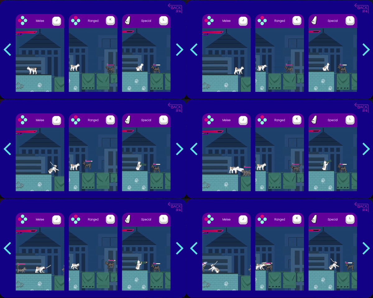
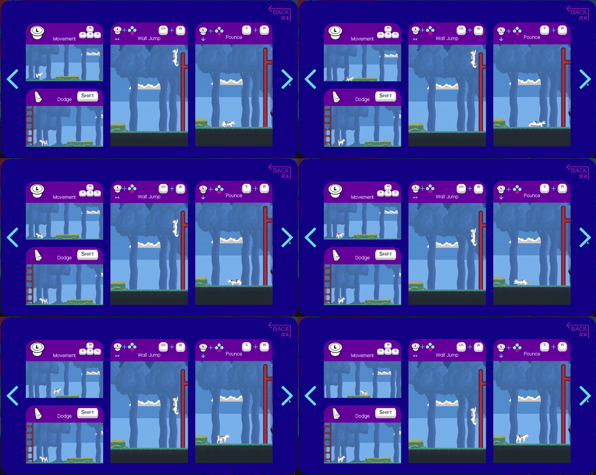
The tutorial was a last-minute addition at the end of production. We had planned to have it in the game for a while, but we needed to wait until everything was nearly complete.
I was particularly intrigued by Brawlhala's tutorial section, where they show an animation of the move alongside the controls. I set up a similar layout, showing videos of the various moves with controller and keyboard inputs.
The tutorial HUD contains:
• A simple checklist of basic moves
• A panel to remind the player of the controls
• Buttons to change your weapon or return to the map
• The regular fighting HUD elements
The player can as much or as little time in the tutorial as they wish, allowing them to become comfortable with the controls at their own pace.
Weapon Select
The weapon selection screen was also introduced fairly late in development. There are three weapon slots with two choices for each. Selecting a weapon displays its name and description in its respective column.
To reduce cognitive load, I mirrored the fighting HUD. This way, the player will know exactly what the setup will be without thinking.
Success & Defeat
The success screen is a simple animation that directly moves a player from scene to scene at a set rate. The defeat screen will remain up until the player decides where they would like to go, back to the map -- maybe to try another level-- or to restart the level they failed.
Further Thoughts
Overall, I am immensely proud of the work that my team and I did on this project. I learned so many lessons about how to work on a team, support my team in a leadership role, kill my darlings for the sake of the bigger picture and meeting deadlines, and doing everything I can to make the best environment for my team so we can make the best game we can.
Looking back on Nyaa-Kuza!! I see how far I have come in my own understanding of UX/UI, working in Unity, Adobe Illustrator and Photoshop, as well as professionally. If I were to make this game again today, I'm sure the UI would be much more polished, and I would be able to make the UI assets myself. However, without the experience I had working on this game, I would not have the skills and mettle to do the work that I love.